
Browse articles
- Getting started
- Start your first project
- Model your project
- Critical path and automatic dates
- Read and rebalance the swimlanes
- Get oriented on the schedule
- Going further
- Give overhead a home with admin projects
- Structure large projects
- Baselines and versions
- Change Gantt bar colours
- Set a revenue target on the schedule
- Getting started
- How Monument models finance
- Revenue from resourcing
- Fixed fees
- Budgeting costs
- Recording expenses
- Recording revenue entries
- Going further
- Formula based pricing and construction cost
- Recurring and periodic fees
- Revenue from expenses
- Modifiers: contingencies and discounts
- Progressive billing
- Pricing templates
- Operational expenses
- Getting started
- Read your Dashboard
- Build a custom report
- Edit a saved report
- Filter a report
- Formula columns
- Freeze a report into a snapshot
- Reports on a project
- Definitions: how each figure is worked out
- Going further
- Time-Series Columns
- Organise your work with tags
- Break reports and accounting down by office
- Control access to business finances
- Control access to rates
- Control who can create projects
- Control project administration
- Control staff and team management
- Control expenses and claims
- Control report definition editing
- Control access to contacts
- Give full project control with Owner
- Manage project work without changing money
- Let project members edit tasks safely
- Share a project safely with Viewer
- Let a team lead coordinate shared work
- Share teammate profiles without management access
- Keep team members focused on their own work
Time-Series Columns
Turn a static report into a trend with time-series columns, one column per month, quarter, or year, spread across every row at once.
What you'll achieve
Spread a report figure across months, quarters, or years so the table reads as a trend instead of a single total.
You'll end up with: A report with hours-by-month columns fanned out beside the totals for every project at once.
Before you start
One number per row versus one row per period
A normal report column gives you a single figure per row, one project's recorded hours, one number, full stop. A time-series column takes that same figure and breaks it into a run of periods instead, hours in January, then February, then March, so the table stops reading as a total and starts reading as a trend.
This builds on the same Projects report shape from Build a custom report. Here, a single hours figure for one of Meridian Studio's commissions gets spread across the months.
It's a column, not a picture
It's easy to assume a time-series column is basically a chart living inside a table, but that's backwards. A chart is pixels, something you look at and can't do anything else with. A time-series column is actual data, real columns sitting in the table, one per period, that you can sort and total exactly like any other column. It lives inside the report rather than beside it, which is the entire point, you get a trend's shape and a table's precision in the same place.
Every time-series column comes down to two settings underneath: a cadence, Day, Week, Month, Quarter, or Year, sets the size of each bucket, and a date range sets the span the buckets cover. Monument works out how many buckets that span needs and adds one column per bucket, up to 60; ask for a span that needs more than that and it keeps the most recent 60 and tells you so. The date range itself can be fixed dates or a dynamic range built from Today, last 12 months, say, and a dynamic range keeps rolling forward every time the report runs instead of freezing on the day you built it, see Dynamic dates below.
You'll rarely set either by hand, though. The Time Series group in the Add Column menu offers presets, and Hours by month is the one you'll reach for most often, opening a configuration panel with sensible defaults you can still tune before adding the columns.
Two projects can show the exact same year's hours while one front-loaded all of it and the other is only now ramping up, and that difference is the actual story a single total can't tell. Spreading the figure into periods makes the timing visible without giving up the ability to sort and total it, which is the one thing a chart genuinely can't do.
Add a time-series column
- 1
Start a fresh Projects report and open the Add Column menu.
- 2
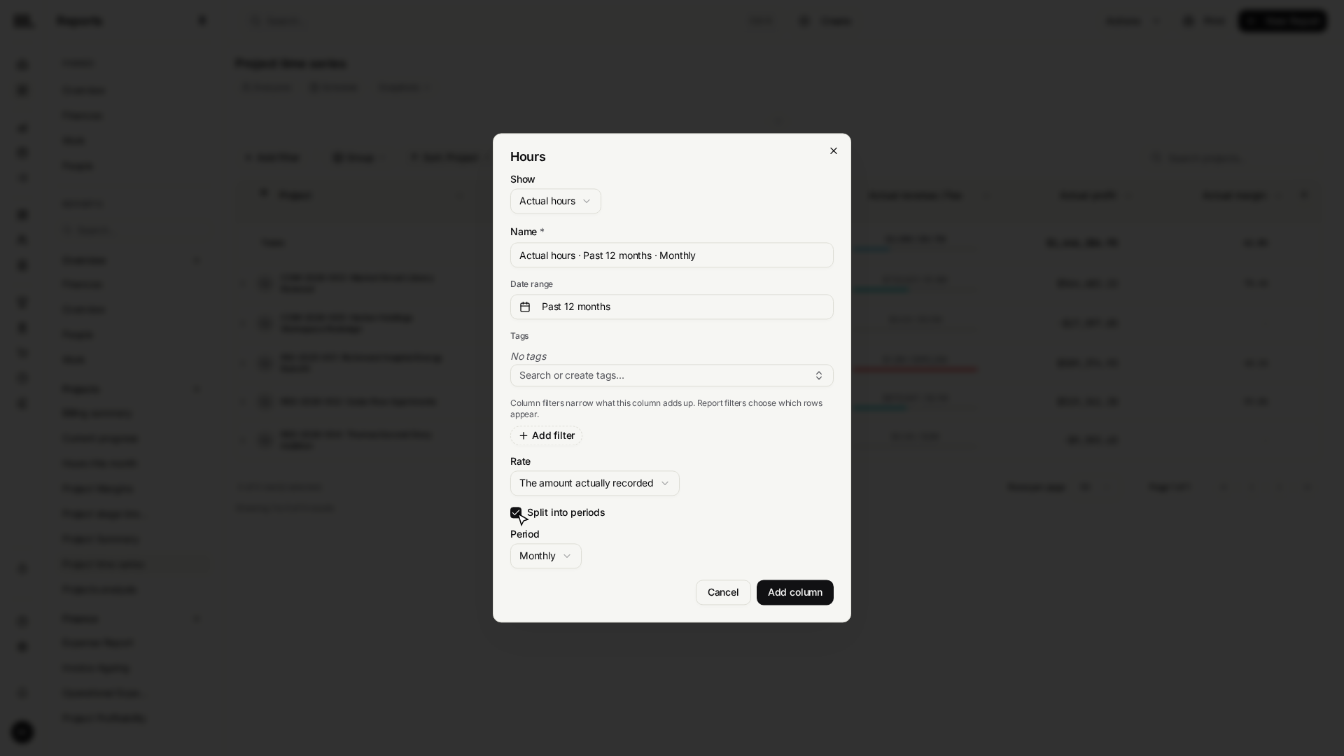
From the Time Series group, choose the Hours by month preset to open its configuration.
- 3
Open the date range and choose This Year, then Apply, so the preview resolves into twelve monthly columns.
- 4
Click Add 12 Columns (or the current count) to fan the hours figure out into one column per month, for every row at once.
Choosing Hours by month opens its configuration with a period already set to Monthly. Set the date range to This Year and click Apply, and Add 12 Columns fans the single hours figure that was one column a moment ago into twelve, one per month, across every project row simultaneously.
When the question is direction, not amount
The presets always show value, the actual figure in each period. Sometimes the real question isn't how much but which way is this moving, and for that there's an advanced editor: Custom Time Series, at the bottom of the Time Series group.
Its window section is simply a Period selector plus the same date range picker as everywhere else in Monument. Here each side of the range offers a third mode beyond Fixed and Relative: Variable, which follows the data itself with a Minimum date or Maximum date, and the preset list adds a one-click Data date range that sets both sides at once, so the window tracks the earliest and latest dates already on the rows instead of a range you pick by hand. That modal adds far more than any preset offers. Custom Time Series lets each cell show Values, a Cumulative running total, percentage or absolute change versus the previous period, or percentage or absolute change versus the same period last year, so a slowdown or a shift against last year shows up long before the running number actually sags. It also lets you set a configurable header label, so a change column can honestly call itself Hours change instead of quietly masquerading as plain hours.
Reach for Value when you want the actual figures month by month laid out plainly. Switch to one of the change modes the moment the real question becomes is this growing or shrinking, the per-period movement makes that direction obvious at a glance in a way a column of totals never will.
A chart buckets rows into periods; a time-series column doesn't
A time-series column, the one this article just built, keeps the report's row shape
exactly as it was, one row per project, and fans a single figure out sideways into more
columns. A chart block does the opposite: it buckets the rows themselves. Add a Chart
block and group it by a date field with Period set to Monthly, Weekly, Quarterly, or
Yearly, and every row whose date falls in the same month (or week, quarter, year)
collapses into one bar, using the same real date_trunc-style bucketing a grouped table
would, not a rough approximation.
Reach for a time-series column when you still want one row per entity with the trend laid out beside it, hours by month sitting next to every other column on a Projects report. Reach for a chart block grouped by period when the trend itself, not the entities behind it, is the answer: total hours logged each month across the whole practice, say, where there's no single "row" the chart needs to keep intact.
Dynamic dates that never go stale
The date range on a time-series column, and every other date range in Monument, report filters, chart blocks, an invoice line's Time entries filter, data import's replace-by-range, isn't limited to two fixed dates. Each side, From and To, can instead be built from a small template: start at Today, add or subtract a count of units, day, week, fortnight A, fortnight B, month, quarter, year, or financial year, then land at the start or end of that unit. "Today
- 6 months at end of month" reads as its own sentence: six months from now, snapped to the last day of that month.
A preset, Last 30 Days or This Financial Year, is a saved version of that same template, which is why picking one never goes stale: reopen the report next quarter and it recomputes against the new Today instead of replaying whatever dates it resolved to the day you picked it. A few worked examples:
- Last 30 Days: From Today − 29 days at start of day, to Today + 0 days at start of day, always the thirty days ending today, whatever today is.
- This Financial Year: From Today + 0 days at start of financial year, to Today + 0 days at end of financial year, the organisation's financial year, not the calendar one.
- A custom rolling window: from the start of this month until six months from now, From Today + 0 months at start of month, to Today + 6 months at end of month, a planning window that keeps sliding forward instead of ending on a fixed date.
Financial year and fortnight units read from the organisation's own settings: Financial Year Starts and Fortnight reference date, both on the Organization tab (Fortnight A starts on the reference date, Fortnight B one week later), see Set up your organisation. Fixed dates still exist for when a range genuinely shouldn't move, pick one straight on the calendar or type it in. Switch a side to Relative and the calendar grays out, since there's no single date left to click, but it still shades the range the template currently resolves to, so you can see what a dynamic range means before you commit to it.
When you need a fixed copy instead of a live trend
Everything on this page keeps recalculating: reopen this report next month and every column, time-series ones included, has already moved on to reflect it. That's the right behavior for a working report, but it's the wrong one the moment you need to hand someone a copy that won't change, an "as of" board pack, or a PDF for a client. For that, freeze the report as a snapshot instead of trying to export a live trend, see Report snapshots for capturing one on demand or on a schedule, printing it, and downloading its PDF.
Troubleshooting
- A time-series column is data, not a picture. If the instinct is to reach for a chart, ask first whether what you actually want is columns you can sort and total, most of the time you do.
- Custom Time Series offers more than Value versus Change. Every preset always shows value. Custom Time Series offers Values, Cumulative running total, percentage or absolute change versus the previous period, and percentage or absolute change versus the same period last year, plus a configurable header, so give it its own header label whenever a cell no longer shows a plain value.
- Columns showing the wrong months? Check the date range's From and To first, a report that looks unexpectedly empty may simply have a range pointed at the future instead of the past.
- A time-series column shows at most 60 periods. Presets and the advanced Custom Time Series editor work the same way underneath: pick a cadence and a date range, and Monument fills in as many columns as that range needs, keeping the most recent 60 if the range asks for more. Need more room? Switch to a coarser cadence, quarters instead of months, or narrow the date range.
- Looking for Print, Download PDF, or Export CSV? Those live with Report snapshots now, a snapshot freezes the whole report, time-series columns included, and that frozen copy is what you print or download.
Where this fits next
You can now build a report and trend it over time. To keep an eye on the firm without building anything at all, the live version of these same numbers lives on the home dashboard. Start there each day, and only build a report once a widget on it raises a specific question worth answering. When you need a fixed, shareable copy of a report like this one, continue with Report snapshots.
Search Monument help
Search help articles and open a result.