
Browse articles
- Getting started
- Start your first project
- Model your project
- Critical path and automatic dates
- Read and rebalance the swimlanes
- Get oriented on the schedule
- Going further
- Give overhead a home with admin projects
- Structure large projects
- Baselines and versions
- Change Gantt bar colours
- Set a revenue target on the schedule
- Getting started
- How Monument models finance
- Revenue from resourcing
- Fixed fees
- Budgeting costs
- Recording expenses
- Recording revenue entries
- Going further
- Formula based pricing and construction cost
- Recurring and periodic fees
- Revenue from expenses
- Modifiers: contingencies and discounts
- Progressive billing
- Pricing templates
- Operational expenses
- Getting started
- Read your Dashboard
- Build a custom report
- Edit a saved report
- Filter a report
- Formula columns
- Freeze a report into a snapshot
- Reports on a project
- Definitions: how each figure is worked out
- Going further
- Time-Series Columns
- Organise your work with tags
- Break reports and accounting down by office
- Control access to business finances
- Control access to rates
- Control who can create projects
- Control project administration
- Control staff and team management
- Control expenses and claims
- Control report definition editing
- Control access to contacts
- Give full project control with Owner
- Manage project work without changing money
- Let project members edit tasks safely
- Share a project safely with Viewer
- Let a team lead coordinate shared work
- Share teammate profiles without management access
- Keep team members focused on their own work
Read your Dashboard
The Dashboard has four tabs: Home, Finances, Work, and Team. Each is a live read on one part of the practice. Learn what each tab shows and who gets to see it.
What you'll achieve
Read the firm's health at a glance on the Home tab, and know what the other three tabs are for.
You'll end up with: You can scan the Home tab in seconds, know which of the other three tabs to open for a deeper question, and drill straight from a number into the work behind it.
Four tabs, one screen each
Open Monument and you land on the Dashboard, and the Dashboard has four tabs across the top: Home, Finances, Work, and Team. Each one is a live read on a different slice of the practice, not a report you generate and then look at once. An invoice getting paid or an hour getting logged shows up on the relevant tab immediately, with no refresh button anywhere.
Meridian Studio runs several commissions at once, Cedar Row Apartments among them. This tutorial tours the tab you land on, Home, in full, and gives you enough of a picture of the other three to know which one to open next.
If your organisation has more than one office, an office selector narrows every tab to one office or All offices. Finances, Work, and Team also carry a scope selector, so you can read a tab for the whole practice, one team, or one project instead of switching pages to get there.
Home: the firm's health at a glance
- 1
Three money cards lead the page: Outstanding invoices, Unbilled work, and Invoiced this month.

- 2
What needs your attention ranks actionable items by urgency, with toggles for over-budget projects, overdue invoices, staff over capacity, and incomplete timesheets.
- 3
Projects needing attention and Upcoming deadlines sit side by side underneath, the risk list and the calendar.
- 4
A practice-wide capacity heatmap closes out the tab, so an overloaded week shows up before it becomes a problem.
Outstanding invoices is everything billed but not yet paid, with the overdue slice called out underneath it, because that gap is the real signal: a healthy firm keeps outstanding well above overdue. Unbilled work is billable time already logged that hasn't turned into an invoice yet, revenue sitting on the table rather than in the bank. Invoiced this month is the value of invoices issued so far this month, before tax, measured against the organisation's monthly revenue target when one is set.
Click a money card's value and you land on the page behind it, invoices for Outstanding invoices and Unbilled work, invoicing for Invoiced this month. The same is true of the rows in Projects needing attention and Upcoming deadlines: click one and you're on that project's page.
What needs your attention is deliberately mixed: an over-budget project, an overdue invoice, someone booked past capacity, and a timesheet that's still incomplete can all show up in the same list, ranked by urgency rather than grouped by type. The category toggles let you narrow that down when one kind of signal is all you're chasing.
- 1
Scan the three money cards across the top.
- 2
Drop to Projects needing attention. Each row carries a cause, Over budget, Unbilled work, Overdue invoices, or a stalled project, and clicking it lands you on that project's page.
- 3
Click Outstanding invoices to open the full invoice list and see exactly what's owed.
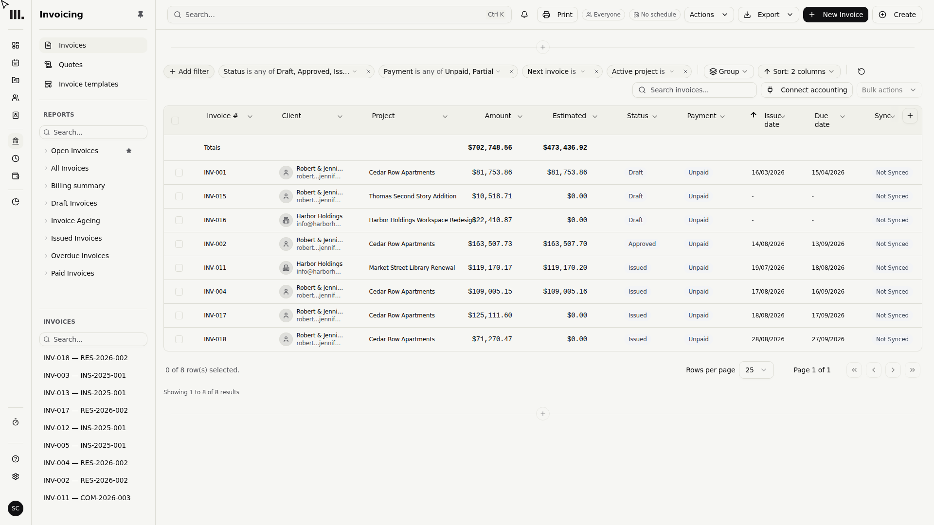
Finances, Work, and Team: what the other tabs are for
- Finances is the money tab: projected revenue against target, profit margin, how many days work takes to reach an invoice and an invoice takes to get paid, quote win rate, unpaid invoices aged into 30/60/90 day bands, and profitability broken down by project size and project type.
- Work is the delivery tab: projects grouped by status and by what needs attention, work in progress, and how milestones are tracking against plan, on schedule, forecast to slip, or already slipped.
- Team is the resourcing tab: a capacity and utilisation heatmap, bench hours by role, timesheet completeness with named missing hours, and leave and public holidays.
Who sees what
Home is visible to everyone. The other three tabs only appear once you have something to show on them: Finances, Work, and Team each need access to at least one project, team, or a practice-wide view in that area, so a tab with nothing to show simply isn't in your tab bar. The three money cards on Home follow the same rule as Finances: without Business finances access, Home shows a smaller, project-focused version of the page instead.
Troubleshooting
- A money card shows a dash instead of a number. That's a loading or access state, not a zero. Business finances access is required for the three money cards; without it, Home shows a project-focused view instead.
- A number looking wrong is a question, not a verdict. The underlying detail almost always explains it, one unusually large overdue invoice, one person over-allocated for a week. Go look before deciding something's actually broken.
- Unbilled work is unbilled, not lost. A high figure is usually just a prompt to raise an invoice, not a sign something's gone wrong. Check whether a milestone's ready to bill before assuming there's a problem.
- Upcoming deadlines only looks two weeks ahead. An empty list means nothing's due soon, not that nothing's due at all, the full milestone picture for a project still lives on that project's own page.
- A tab you expect isn't in the bar. Finances, Work, and Team are permission-gated. If one is missing, check your access with an admin rather than assuming it's broken.
Where this fits next
Home flags that something's worth looking at. To find out why, and slice the firm's data by project, status, or period while keeping that exact view for next time, build a report in Build a custom report. To understand where a project's financial numbers actually come from, read the financial model overview. To save and compare revenue forecasts, open the scenario picker in Revenue forecast.
Search Monument help
Search help articles and open a result.